Colour Harmony Home
Have you ever looked in the mirror and you really don't like yourself?
The dull and sad face, that gray shirt doesn't really value you...
You turn around and notice your favorite blouse on the chair, the red one, and immediately the smile returns.
You wear it, and you look like another person, brighter and brighter, even more positive and courageous.
Those who observe you compliment you on your brilliance and radiance, while yesterday, wearing an antique pink sweater, they asked you if you were okay...
As a well-known expert in the sector, Rossella Migliaccio says,
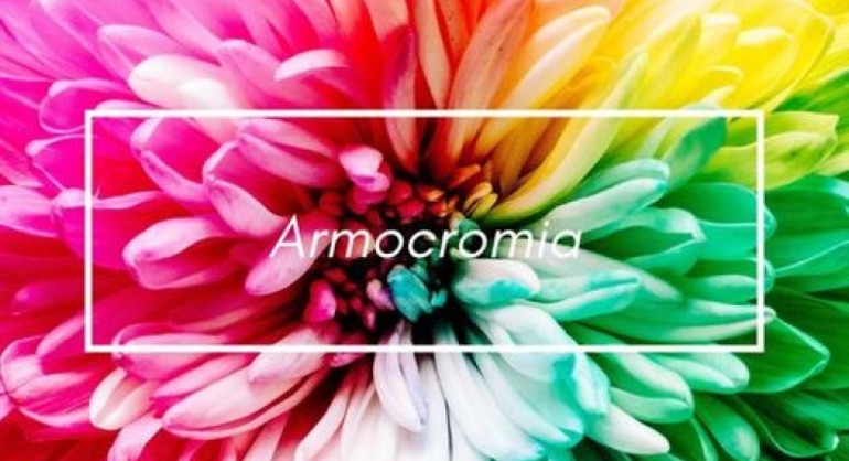
"It's not magic, it's color harmony!"
Have you ever heard of this fascinating matter?
Color harmony is the color analysis aimed at enhancing the aesthetic aspect of a person starting from his chromatic characteristics, such as the tone of the complexion, the color of the eyes and the hair.
(Source: Crusca Academy)
The seasons of color harmony refer to the four seasons of the solar year:
Spring, Summer, Autumn and Winter.
Every season, just like every person, has unique, wonderful features and colors.
What if we also associated color harmony with home furnishings?
Spring, the season of flowering and rebirth, has by association bright and saturated, light and warm colors, warm undertones, clear value and high intensity.
If after undergoing an armochromatic analysis you discover that you are a spring, why not think about painting the walls of your walls in a beautiful apricot color?
A coral colored sofa, sunny yellow cushions? Warm and welcoming colors that smell of family, home and love.
Summer Palette
Summer is the season characterized by cold undertones and low-intensity light colours, such as delicate pastel colours, such as white (not bright), gray and taupe to combine with colors such as pink, lilac, aqua green and heavenly.
Therefore we welcome light, powdery, desaturated and relaxing furnishings.
Imagine a house by the sea with a dove gray sofa, light blue or Tiffany green curtains, very light paintings on the walls and a ray of sunshine that wakes you up through the window in the morning, can't you seem to feel the sea breeze on your skin?
The Autumn season is characterized by warm undertones and dark value, low intensity, its colors coincide with the homonymous period of the year that precedes the coldest season, therefore with the colors of the earth, such as the colors of the foliage, red, orange , warm yellow and brown. These colors are very elegant associated with beige, red and orange in soft tones, with particular attention to the wonderful teal color, a restful and elegant color.
Perfect colors for a rustic wooden house in the countryside, with warm and welcoming furnishings.
(The armchairs in our office are teal colored and we love them very much, ed)
We arrive at the last season, the most widespread in Italy, dark and elegant, the Winter season.
It has a very cold undertone, dark chromatic value and high intensity, deep and dark shades reign here such as black, gray, purple, electric blue and intense and passionate red.
The dining room furniture in lacquered black with a contrasting optical white, white sofas with flaming red cushions, denote character and depth.
In principle, to obtain harmonious furnishings, just like a perfect outfit, we start with a basic color that belongs to the season, a minor color and a complementary one.
We at HD Remington, thanks to our experts, can help you choose custom-made furnishing accessories, with your "friendly colors".
In this way your home will be harmonious, harmonic, relaxing and restful, it will reflect your season and your personality.
Sources:
https://glamcasamagazine.it/armocromia-e-arredamento-arredare-casa-in-base-alla-propria-stagione/
https://blog.infabbrica.com/armocromia-arredo/